La Calle
Reconstructing Seville’s ceramic street lettering as a working OpenType font.
Starting with evidence
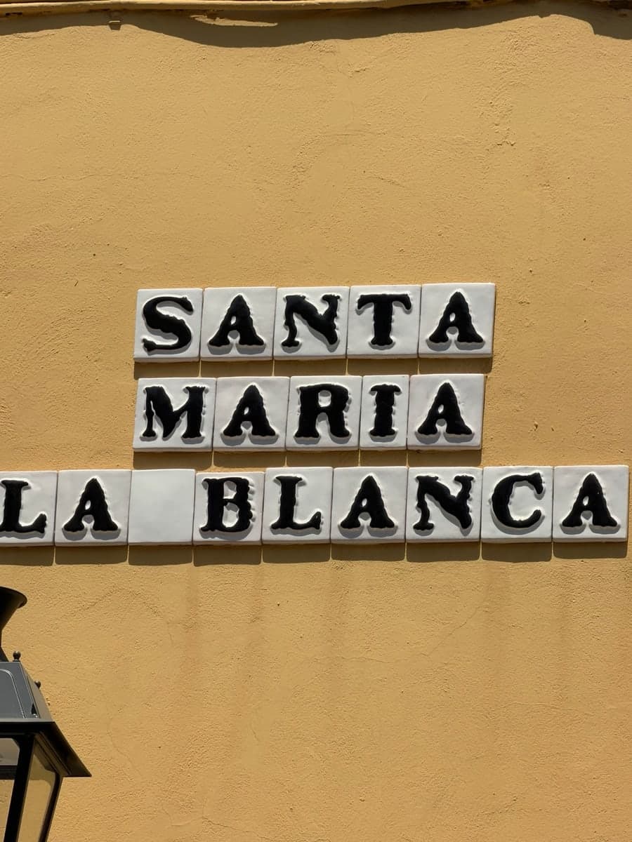
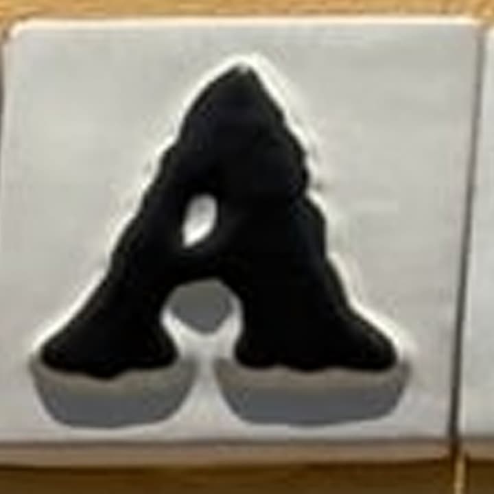
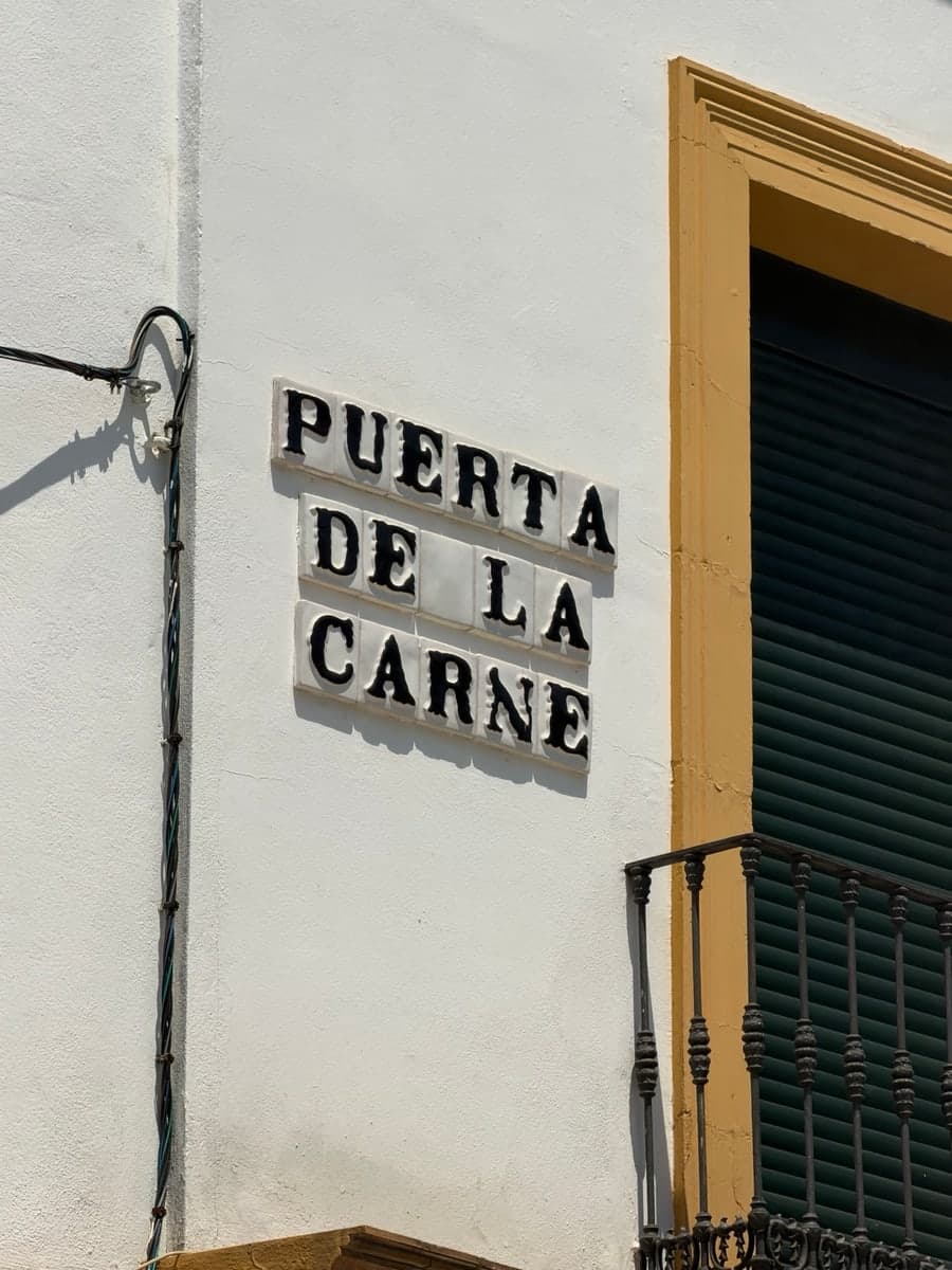
La Calle began with two photographs I took in Seville: one of Puerta de la Carne and one of Santa Maria la Blanca. Each letter sits on its own tile. The shapes are formal but not mechanical. Serifs widen unevenly, curves swell, and repeated letters do not quite repeat.
The two photographs gave me direct evidence for A, B, C, D, E, I, L, M, N, P, R, S, T, and U. A small set of clearly licensed photographs added a few more useful forms. Every source, right, visible glyph, and reconstruction decision is recorded in the dataset.
Orderly from far away. Odd when you look closely.
A font, not a tile alphabet
I wanted the primary artifact to work in normal design software and on the web. La Calle is a traditional OpenType family with a character map, metrics, kerning, alternates, and installable OTF and TTF files. The ceramic renderer is a presentation layer around the same outlines.
That choice forces the project to answer ordinary type questions. What should happen when someone types lowercase? How much room does a broad A need next to an R? How should an accent sit above an already tall painted form? The v0.1 answers are intentionally practical: lowercase maps to the capital designs, accents are composed from drawn marks, and A, N, and R have distinct photographed alternates through ss01 and salt.
Building the system
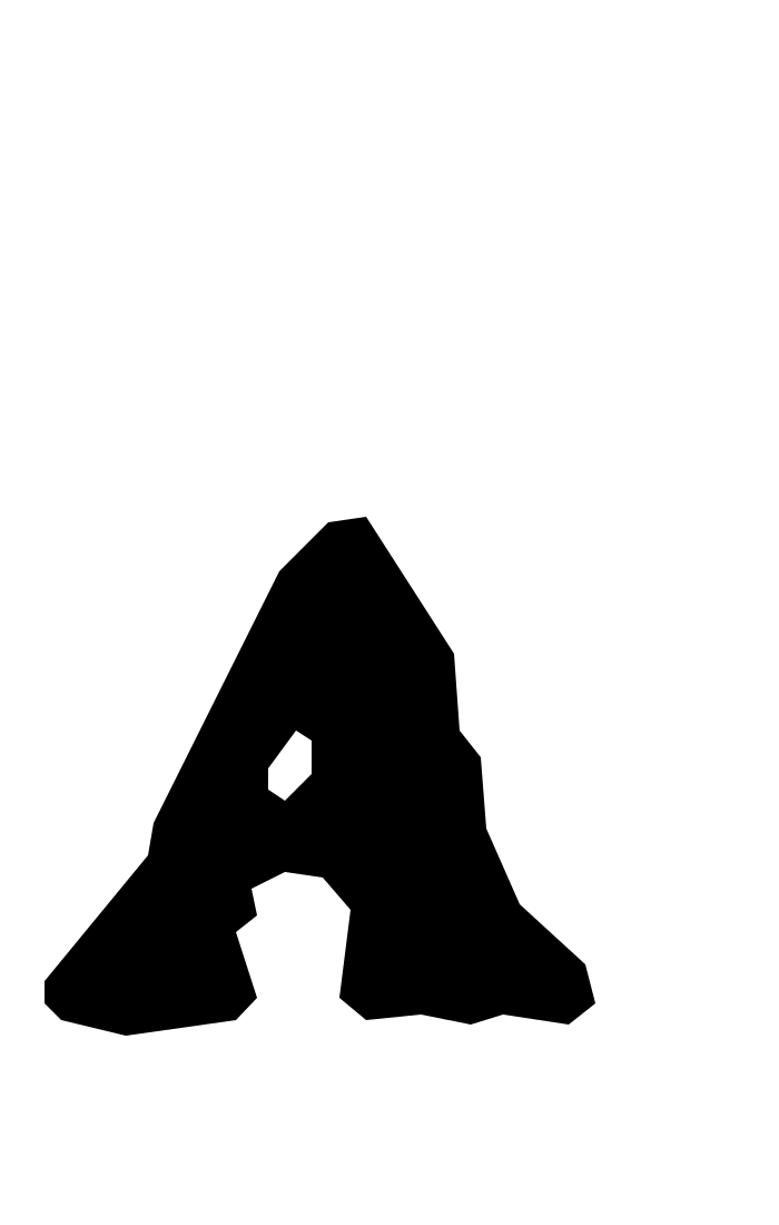
The pipeline normalizes the images, records manual crop annotations, constructs clean closed outlines, assigns shared metrics, compiles the font tables, and validates the output. I used procedural drawing functions for recurring strokes and bowls instead of pretending every missing character had appeared in a sign.
F follows the observed logic of E. H combines source-derived stems with a crossbar. O and Q grow from the same bowl ideas visible in C. The diagonals in A, M, and N inform V, W, X, and Y. These are design decisions, not historical claims, so the provenance file labels them as reconstructed.

What shipped in 0.1
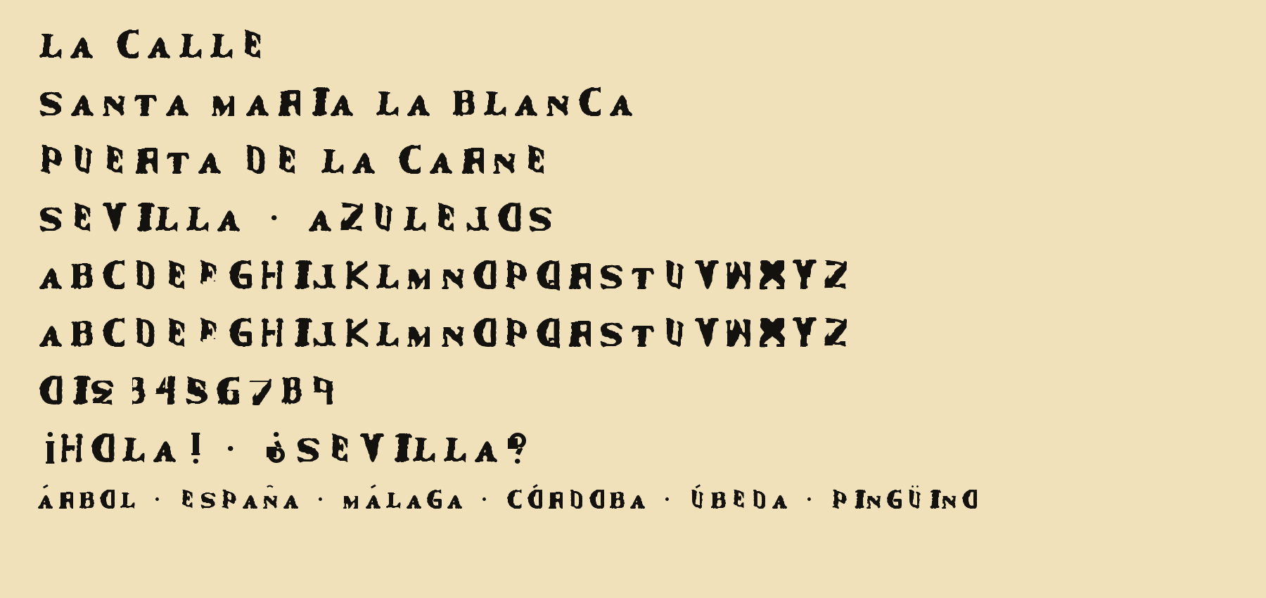
Version 0.1.0 includes A to Z, intentional uppercase-mapped lowercase, numerals, core punctuation, Spanish inverted punctuation, Á É Í Ó Ú Ü Ñ, basic kerning, and photographed alternates for A, N, and R. The source release provides OTF, TTF, WOFF2, sanitized outlines, provenance, build and validation scripts, reports, and documentation.
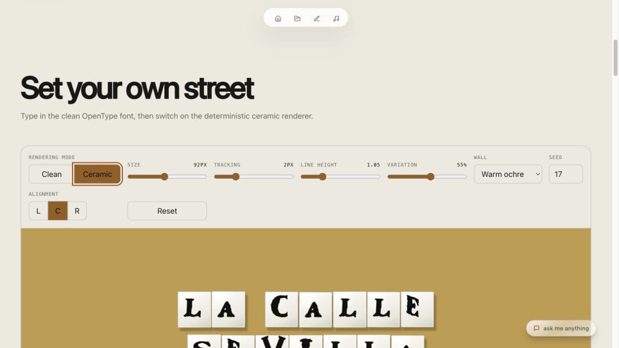
The tester’s clean mode isolates the letterforms. Ceramic mode puts each glyph on a generated glazed tile with deterministic variation in angle, position, scale, and shadow. It restores context without claiming to recreate a specific historical sign.
The limits are part of the release
La Calle is not an exhaustive survey or a definitive digitization of Seville’s street lettering. Some forms have direct photographic evidence. Others are reconstructed to make the font usable. The numerals and punctuation are new designs, and lowercase is unicase.
I would rather release that honestly, with the sources and gaps visible, than imply a historical completeness the project has not earned.