I Fell in Love With a Font in Seville
I kept photographing the city’s ceramic street signs. Then I tried to turn their strange, handmade lettering into a real font.
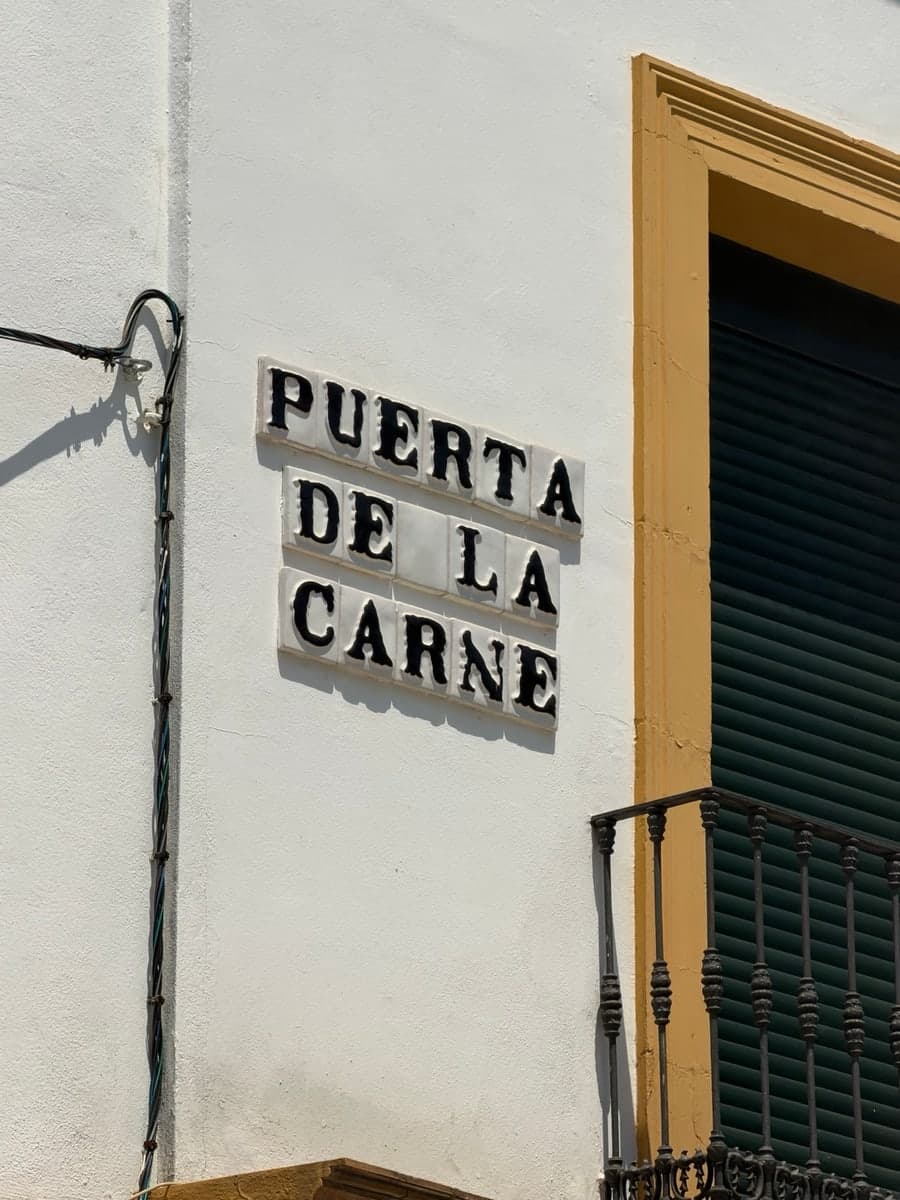
I fell in love with a font in Seville. At least, I thought it was a font. I kept taking pictures of the city’s street signs without a project in mind. I just liked them.
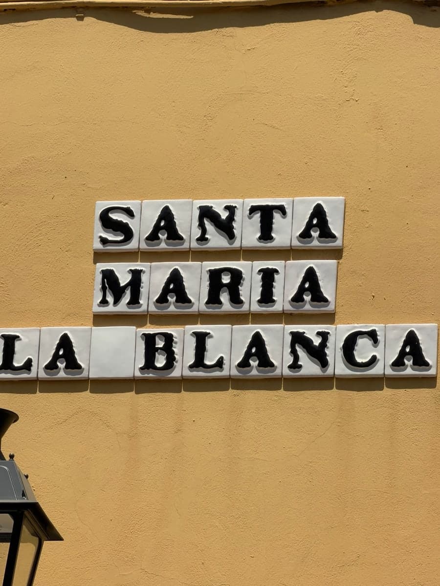
The signs I noticed were made from ceramic tiles, usually with one large black letter per tile. From a distance, the words look orderly. Up close, they are much stranger. The feet of the letters flare at slightly different angles. Bowls swell. Joins pinch. Two versions of the same letter can feel related without being identical.
That was the part I wanted to keep.
The limits changed the project
I had two photographs of my own, one from Puerta de la Carne and one from Santa Maria la Blanca. Between them, I had enough material to recognize a system, but not enough to claim I had found an alphabet. The visible letters covered only part of A to Z. There were no numerals and very little punctuation. Even the letters I did have were affected by perspective, glaze, shadows, tile edges, and whoever painted them.
So the project became a more interesting question than tracing a sign: how do you turn partial evidence into a usable font without pretending the missing parts were there all along?
Deciding what counted as evidence
I built a small dataset around the two photographs, then researched matching signs through original source pages. For every candidate, I recorded the source, license, visible text and glyphs, image dimensions, quality, perspective, glare, occlusion, and whether direct reconstruction was permitted. The manifest is intentionally more rigorous than a mood board.
It also includes a reference-only group. Some images had unclear rights. Others were useful context but did not meet the direct reconstruction rules. I kept their links and notes, but did not use their pixels to derive outlines.
That boundary made the design process clearer. A source-derived glyph has permitted photographic evidence behind it. A reconstructed glyph is newly drawn to fit the system. Both belong in the font. They just do not have the same provenance.
I did not want to trace the dirt
The ceramic surface does a lot of visual work. There are grout lines, irregular color, chips, reflections, and weather. Tracing all of that would turn one photograph’s accidents into permanent letter anatomy.
I looked instead for the parts that repeated: heavy strokes, broad terminals, uneven curves, pinched joins, blunt endings, and a compact rhythm shaped by the square tile. Those qualities became drawing rules for stems, bowls, diagonals, serifs, and accents.
This was especially useful for missing letters. The direct evidence does not show every character. F, G, H, J, K, O, Q, V, W, X, Y, and Z had to be reconstructed. Numerals and most punctuation are also new designs. Accented forms combine their base letters with drawn marks. Lowercase maps to uppercase on purpose, keeping this release close to the all-capital source material.
This is where type design becomes less like copying and more like making rules. You draw an H that was never in the photograph, then ask whether it can stand next to the photographed A and E. You make a decision, but you label it as a decision.
A useful font needs evidence, rules, and boring checks.
More than a folder of outlines
I wanted La Calle to be a real font, not a visual mockup. The build script creates the glyph outlines and assembles the OpenType tables. It defines the family as La Calle, the style as Regular, and the PostScript name as LaCalle-Regular. It exports an installable TTF, an OpenType CFF OTF, and a WOFF2 for the web.
The release includes uppercase A to Z, uppercase-mapped lowercase, digits, core punctuation, Spanish inverted punctuation, Á É Í Ó Ú Ü Ñ, basic kerning pairs, and distinct photographed alternates for A, N, and R. The alternates are exposed through ss01 and salt, not a filter that adds random wobble.
The validation checks the names, version, character map, outlines, advance widths, provenance coverage, OpenType features, and package contents. A font can look convincing in a screenshot while failing at these boring things. The name table can be wrong. Lowercase can disappear. A ZIP can contain an old build. Those checks are what make it usable.
Putting the letters back on the wall
The interactive specimen has two views. Clean mode shows the font by itself, which is the quickest way to inspect the spacing and shapes. Ceramic mode puts every character on a generated tile. It is not a simulation of a specific sign or historical glaze. It restores some context around the real font outlines.
Both modes are editable. That matters because a typeface should not only look good when it spells its own name. You should be able to type a neighborhood, a person’s name, or a completely ordinary word and find out what the system does.
What 0.1 means
La Calle 0.1.0 is deliberately incomplete. It is not an exhaustive survey of Seville’s ceramic street lettering. It does not identify a single historic workshop or maker. It does not claim that every sign in the city belongs to one standardized alphabet.
The lowercase is unicase. Broad Latin Extended coverage is not there. The numerals and punctuation are reconstructed rather than observed. A small set of alternates can suggest handmade variation, but it cannot model its full range.
Those limits point directly to a later release: more user-owned or clearly licensed photographs, better evidence for missing uppercase forms, independently drawn lowercase, refined punctuation, and broader language support.
But the interesting thing already works. Two photographs became a research set. The research set became a drawing system. The drawing system became an installable font. The font became something anyone can type with.